Sharon Shivel: a message from nature

Surrealism is certainly potent in the delicate works of Sharon Shivel. When I went to view them at the Parkland Library while on display until the end of August, I could not help but want to dissect them all. Each of them tells its own story, taking us back to the prevalence of nature and in tune with the realities of today. The works are  dynamic and certainly opposed to the discrepancy-specific environments that each composition entails. Here I explore each of Shivel’s acrylic intricacies and attempt to anatomize the message that she finds and portrays from nature.

“Hope on the Horizon” is an acrylic painting on canvas, with overtones of connotation, and diversions like puzzle pieces that surrealism supplies. The bodiless configuration of the female suggests that the rest of the self is in the background. The emotions are revealing of the water, and the consciousness within the sands. Her roots in the forefront seem to be a bid to cover the mystery that interestingly and inadvertently tells all by the irony of only her right eye being exposed. It is the eye that is the focal point that’s applying the symmetry, and by its subvertical alignment before the integral of vision displaces at the horizon.

Quite possibly, the clouds off the horizon could be analogous to electrical configurations of the subject, and the thought processes, posing at the overall conjuncture of the composition. In the topic of  “hope,” the message could very well be a substance applying the importance of self-awareness.

“Oy Vey” (a Yiddish phrase expressing dismay or exasperation). Well, it is often said we should avoid talking about politics; however, politics seems to be screaming at the reciprocal of this platform, and is quite detailed. The mood changes considerably in this composition and, moreover, toward its undertones that are held of voicelessness and in the context of politics that surround the topic. Instead, Shivel seems to articulate the protection and safeguarding of the nurturement of nature, embracing it as a mother would her child. All the while, the feminine subject is emphasized as still attempting to save her head. The chosen animals involved add to the visual dynamics of this piece. The work speaks its message quite transparently, as Shivel takes the viewer through the storm of its exquisite composition.

“Another Day Another Dollar.” Acrylic, paper, coffee filters, and styrofoam quite clearly deliver what this artwork speaks about, and three-dimensionally. Paradoxically, it is quite fun to look at, while maybe not the evidence that extracted from it likely was. More so, the experience hits the message on the button, becoming a question at hand: Is it all worth it?

“Victoria’s Lament.” This painting in acrylic on canvas is another work that Shivel uses as background to the theme of emotion from off the composition. Here, what an emotionless Victoria lacks in the expression of her face is the emotional journey spread of the sea in which she dwells. And as she grasps what past is entangled with roots, the message is exposed as a question: Is it the effort to reach what washed up on the shore, or is she letting go?

Shivel exposes the hypothetical nature of mythical reasoning to converse about choices, provoking thoughts about which can be claimed, and what came first and why. Too often in life there’s a threshold that forces one to give up one thing for something else. Perhaps this message is about nature’s natural procedural of balance.

“Cry” is an emotional painting of mixed media and acrylic on canvas that seems to be a transcendence from “Hope on the Horizon.” Undoubtedly beautiful, clearly the message portrayed here is about conservation: a very important one at that.

“Eye of the Storm” is acrylic and fabric on canvas that appears as a metaphorical sense of what weather does.  It gives a sense of how time and place both create the environmental stress, and how it functions both as the action and effect.   While a psychological fraction of its pressure costs is left to be freely interpreted, the transcendence of color is interestingly viable from the skies of “Oy Vey.” This three-dimensional concept brings its extraordinary essence of interpretative vision right in front of viewers to investigate for themselves.

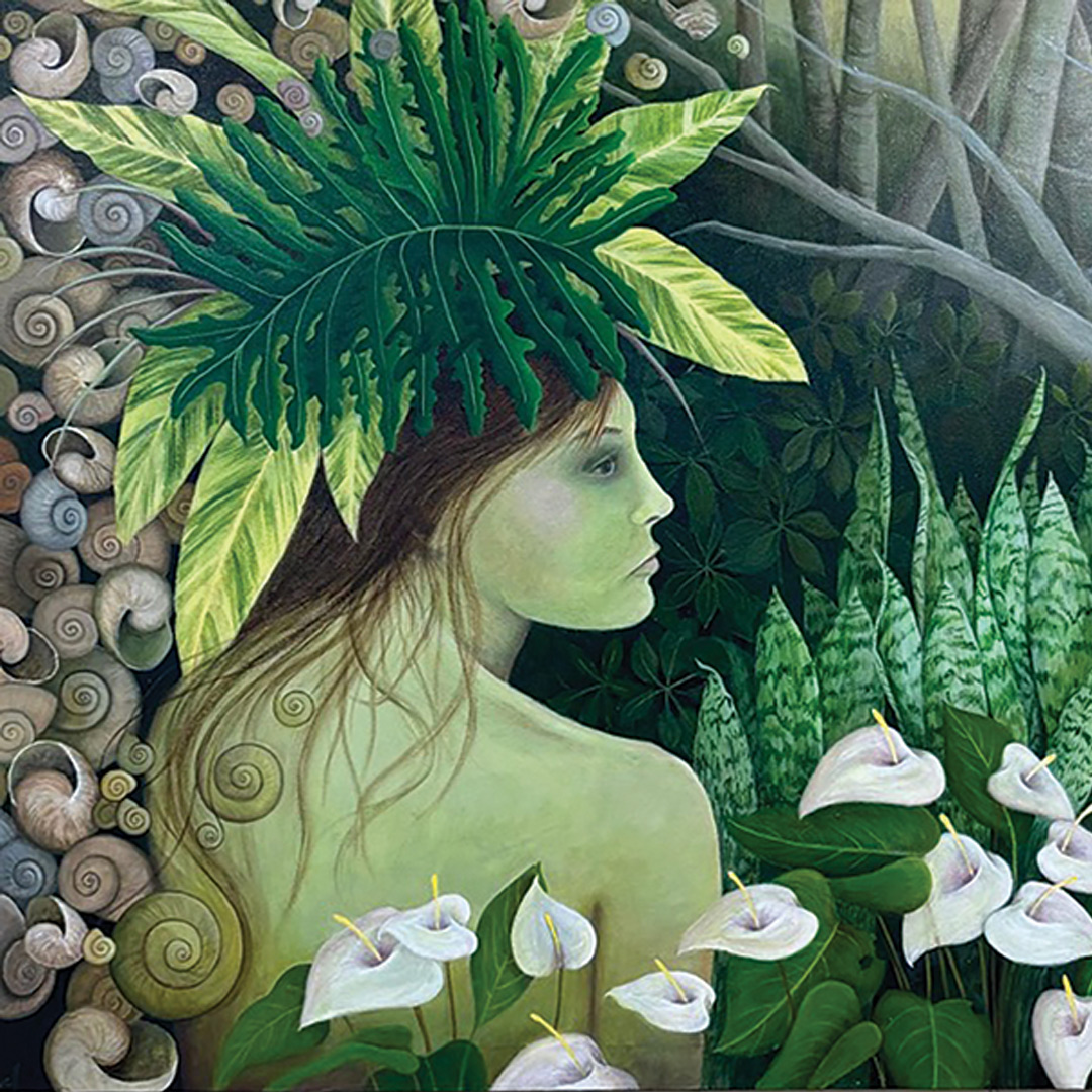
“Garden Nymph Contemplating the Effects of Climate Change.” Shivel’s acrylic on canvas has a surrounding seven-piece set of 8-inch-by-8-inch small canvas picked by the theme of its subjects’ motivation. This painting emphasizes the prose of the composition while its muse blends into the delicate magic of care along its landscape. The conjunction of sea life and botany coheres with the abstract thought behind her, riveting color as a tool to emphasize the need for survival. The intensity of this work is honest and provokes emotion, as is seemingly needless for any visual input by its cause. Instead, this painting’s subject is from a perspective at the other side of it. Interestingly, no matter how colorful the composition is, it still leaves the viewer with a sense of emptiness: the irony entangled with the subject at hand.

“Cosmic Winds I & II” is acrylic on canvas, both pieces integrate pebbles into galaxies, expressing the stepping-stones toward the bigger picture. What a lovely path Shivel makes of it, and within the discrepancy that time decomposes, as color fills any negative space rhythmically imposed by the contrast of suggested wavelengths. Its mundane choice of compositional trajectory keeps the subject communicating along with the connectivity of it all. Very powerful.

Sharon Shivel is a New York-raised, local Floridian residing in Parkland who studied painting at the Boca Raton Museum Art School in the 1990s. Her works have been displayed around South Florida quite fluently, and they’re held in private collections between Canada and the U.S. For more information, visit www.sharonshevellart.com.


Scenes for summer: Nava Lundy

Adaptability. From the plasticity of an organism, to neuroplasticity of the human brain, to simply adapting to life, this quality engulfs us all.

Nava Lundy is no stranger to it. She has been painting all her life, and professionally since 1998. Lundy has transitioned from drawing from live models, and traveling with a sketchbook in her hands, to domestically taking memories from old photographs. While life changes, so do her strategies to make her art adapt. It is a mastery that has drawn her works of gold. Quite literally, actually.

Lundy’s canvas always begins already full. Her textured backgrounds build upon one another to create her “set.” Gold shines through her muses to highlight their beauty. It accents as a complementary emphasis in her compositions.

Lundy holds a certification in painting from the first art academy in America and a bachelor’s degree in fine arts from the University of Pennsylvania. She was taught in oils, but when she got pregnant with twins, her choice of medium changed to acrylics. “It was too dangerous,” she explained.

Either way, omnifying her art remains the offset to her strategies, and those who prefer oils may be fooled, if not take a double-take, when viewing her work.

This month we adapt to the summer with some of her refreshing themes.

Hats. The Studio E Gallery in Palm Beach Gardens seems to be selling several of Lundy’s hats this time of year. Why wouldn’t they? There is always a seeming mystery left to the viewer that entices wonder and imagination as to the subject. Who is behind the hat? Is that you?

There is an elegance and sophistication present in these themes that is suggested in her characters. “Escape” (2021), a 36-by-36 acrylic on canvas (sold), is one of them. It warms you up and cools you down at the same time. Who wouldn’t want to dip their feet in the water and sip on some pina coladas in the hot summer months ahead? Let’s hope to do so!

Her lively art demonstrates concepts with which the viewer can connect. It is something to appreciate. When asked what motivates her, the answer was quite a simple one:

Mood. It is a natural contributor to Lundy’s work. “Watermelon Sugar,” a 36-by-72 acrylic on canvas, is a lovely example of mood (title picture), especially this time of year.

Before 2021, Lundy may not have chosen to work with water’s ripples and reflections. She referred to it on social media as something that once was “daunting.”

However, it seems the mood got contagious, according to Lundy, as attempting the complexity of water compositions has brought joy to do them, and cooling off can be quite the observer’s delight!

For beach lovers, “Come Sit Beside Me” (2024), acrylic and mixed media on canvas (sold), brings a calming elation. Here distinctively are the vibrant accents of gold. The composition brings together the stubborn strokes of dissonance into a graceful escape.

Lundy’s work has been used in several set designs in films, is part of the permanent digital collection at the University of South Florida in partnership with the Florida Holocaust Museum, and is in the permanent collections of private collectors, universities, and museums around the world, including Australia, Canada, and Israel. More locally, Lundy has exhibited at the Fort Lauderdale airport. She is an internationally recognized artist right here in the local community.

To view some of Nava Lundy’s muses, her online gallery is at navagallery.com.


Jennifer J.L. Jones: Piece in nature

“Echoes of Elysium” is the exhibition on display at New River Fine Art on Las Olas Boulevard in Fort Lauderdale through April. Artist Jennifer J.L. Jones finds her employment in the abstract contemporary trends and transforms them into the botanical atmospheres that cohere to the observer’s metaphysical hemisphere of realistic conjuncture. The strategy is by the composites of layers, not by the disconformity of postmodern rejection, but the singular reluctance to recognize concentrations between values. The artistic empirical is apparent. In agriculture, the thumbnail would be up and the hands would be down. 

Jones was born in Virginia and was raised between there and the east coast of Florida. Currently settled in Port Royal, South Carolina, she holds a bachelor’s of fine arts from the Art Institute of Chicago. 

In “Collections,” if you will, in free will, that employs the atmospheric abstracts into the altercations between hemispheres that lather by the waste sides of mere entropy is instead gorgeously assigned to her earlier works of “Hypnotic Starlings” (2016). Here, the division is in black and white, and the value is laid out indusively by color choice. The whites and blues drip, and the reds? A staged presence in a spacious spread of reasoning, and to the “Tejas,” mixed media on wood (2014), in the “Lacuna” series. 

To view the past collections, visit www.jenniferjljonesstudios.com/collectedworks.

Is this Euclidean geometry by color? “Odyssey,” currently on display at New River Fine Art, is a requiem. If one was to follow the leaves of green, the shape appears to heed the branch of mathematics that puts axioms and postulates in place on a flat space. The relationships of points are defined by color choices, at the angles intended, and beneath the fluidity, lining them up and into visual consonance.  

It shouldn’t go further than that, space, to distinguish the difference in hemispheres: one, the choice to avail dissonance into one’s solutions, or two, the opposite of where one must withdraw and appreciate the length of the objective segment itself. Jones shows her skills and artistic mastery in this light.

Distance is on the other side of it. This empirical nature goes only as far as it needs to go. It is witnessed that the closer one arrives to “Untitled,” the more abstract the artwork becomes. The potency of floral arrangements from a postmodern world extracts the work’s serenity as a schema, and in turn, dimensions are idealism. Dimensions are the elongated measures of the botanical muse to see what needs to be seen, and when it arrives. The disregarding sensuality of exposed synthetics demises what stem and into the true nature of a visual connection. What a very delicate balance that absurdity can bring! 

Still, are the flowers.

A mythological state of perfect happiness, where botany molds to the surface, is Jones’s earlier work from 2017, “Midnight for Butterflies I.” It may very well translate for some as a still life from 17th-century Dutch artistry. The change from stroke to the use of line is highly emphasized. It is a clear takeaway from traditional portraits with flowers in a vase—to, who needs a vase when you have colors to focus on? Jones takes the eerie darkness from the Baroque era and colors it lively.

Her change from 2017 to works on exhibition today is still a psychological sense of untiming. In “Cailleach” (2024), the black-and-white orthodox grows on the subject of butterflies, if at all intended, bringing shape to the subject, certainly by stroke. 

The means to the instance is of the goddess this art is named after, or “veiled one,” which is sparkled with gloss, clung to width by the blue of the skies. 


Artist Marina Veen: Mirrors to the soul

“I get bored easily,” Marina Veen told me over tea and coffee and a lovely stroll together. A very independent, hard-working woman, Veen played a corporate role since her early 20s. During the Covid pandemic, she found the change she had been searching for.

This career adjustment fed something more important—her soul. “Two hours of meditation wasn’t enough,” Veen said. “It was time to reset.”

During her early years of taking art classes and drawing, Veen was confronted with bias technicalities in creating art—the type of technicalities that hold to rules, the type of technicalities that can hinge creative development, imagination, and heart. She found it void.

“I wished somebody would’ve told me that it was okay to reject technique,” Veen said. “I probably would’ve gone back to art much sooner if I had.” She instead held a conscious mindset toward life as she built it. In her search for something much deeper, it seems that it’s the rejection where she finds the connection to her motivation.

“If I see it is a tree, I am no longer interested,” Veen said. The intense colorism of the works by Henri Matisse in the early part of the 20th century is a good example of where her motivations belong. It is the type of connection that holds the equilibrium between mind and emotion to meet at the surface. It is the intangible reality we all silently attend to. How it is translated, or if it is clear, is something everyone experiences at one point or another. Yet it is here that Veen finds her answers by reflection. The canvas: a mirror.

Darkness to Light

Veen pulls the light from the shadows without manipulation. It is raw and undefined—until it isn’t. The light has been set, revealing the integrity and utter honesty of her focus. It is amid the darkness that one can view, in “Drift by My Windows,” recently displayed at the Parkland Library. Time predisposes beneath, where it is clear by the textures of depth nondiscriminatory. However, beneath all the textures are the stories untold.

Upside Down

Veen is a Ukrainian-American originally from Odesa, who spent much of her prime in the hustle and bustle of New York City. After moving to the California Bay Area with her family and for work, she thought she would never return to the East Coast. The artistic resilience of California held a spark. Yet, things happen. While moving to Seattle for her work with Amazon and Microsoft, and during the time of Covid, she saw the big picture.

“In Between” is an excellent example. If viewed from the opposite direction, one may see an unbloomed flower. Still are the layers on the canvas used to demonstrate perspective. Her impressively high originality cannot go unnoticed. The rejection of a still life is recreated in an entirely new definition of quality, and coincidently, it had been painted upside down. The fluidity of rhythms shines in the sheets of layers, and per the use of perspective, the story unravels, much like the rigid nature of corporate Seattle.

Lavender

The color certainly molds to the surface in characters offset of white. The character is within the color that would commonly be overlooked if not made aware of. Here the body holds much more than its weight. It is in echoes of colors beneath where the lavender-like blend developed unto its finish. During Veen’s weeks of working on this piece, “Echoed Through Me” is just one example of how her work undergoes a total metamorphosis of change—until it speaks fluently.

Methods and Media

Veen is inspired by the songs and poetry of Leonard Cohen, Radiohead, Arctic Monkeys, and Rainer Maria Rilke. One can feel the rhythmic fluidity that shows through to the surface of her pieces. It is a movement of poetry held in the textures beneath the surface of her media. Mixed media, acrylic, cold wax and oil, collage, stenciling, gelli plate printing, woodblock printing, and mark-making are just some of the resources used to create her compositions. Her method—addition and retraction.

Veen’s first group show was in September 2023 at the Macy Gallery at Columbia University in New York City. Last summer, she and her family settled in South Florida. There is high anticipation for more of her work still to come.

Today, Veen continues expanding her artistic communication of lost expression through her talent. Her work can be viewed at marinaveenstudio.com and on Instagram at marinaveenfineart.

Harold Garde: 100% to just shy of 100

Who remembers the GI Bill? It was a range of benefits provided by the U.S. government for World War II veterans returning home after the war. Through it, Harold Garde received his initial art education at the University of Wyoming. Seven decades later, the artist’s education engages and challenges us in his works across the decades.

Garde, “the rebellious provocateur” as GrowingBolder.com has put it, was born in New York City in 1923 to Eastern European Jewish immigrant parents. He joined the U.S. Air Force and served in the Philippines and World War II from 1943 to 1945. He was exposed to Abstract Expressionism during his educational years, which clung a bit to his early career.

Garde’s prolific art career began in the later generation of Abstract Expressionists during the 1950s and ’60s. Early influences of Surrealism and Figurative painting in his educational years also seem to have held a motif to his later work. As his career matured, he seemed to grasp an individual gestural abstraction into the figurative forms of art. His works withheld hints of influence driven by the period of Neo-Expressionists between the 1980s and ’90s.

In 1984, Garde and his wife moved to Belfast, Maine, where many of his earlier works are represented. Garde was able to find his place as an artist in Belfast, where he remained an influential contemporary American artist making his mark on the world. In 1993, it was on to New Smyrna, where he then split time between Maine and his Florida home. Garde died Oct. 11, 2022, in Florida, just shy of 100 years old.

Garde invented Strappo printmaking in the mid-1980s as Neo-Expressionists were busy affecting conceptual and minimal art with their intense subjectivity. He developed this technique by combining printmaking and painting as an artistic ambivalence of originality worth mentioning. It is a transference of acrylic paint layers from smooth surfaces, such as glass, onto paper. The technique gives a reversal image of the layered medium, and a “Strappo Monotype.” His famous 2005 “Self-Portrait,” not at all shy by use of line, was acrylic Strappo mounted on paper. Garde taught his technique in workshops nationwide.

Garde challenges us to look back to the post-war movement in a new depth of today’s reality. His work transcends generations; to view it is to feel the past as an offset to emotional provocation. In the art industry, it is well identified that successful art is a work that provokes emotion, or which provokes a distinctive reaction. It is a work that defends itself while connecting points of view within the psychological stratosphere of others. It is a movement with time, as Garde proves to us, in shadows of color and thick use of strokes.

For example, “Nude Woman 2” is a geometrical offset between spatial relationships, and it is fortified with contrasts of color. It can be a reminder of the short-lived Fauvism even before his time. In one way, Nude Woman 2 appears to be divided into four separate sections. When we look deeper, the form absorbs its colorful depth, and into a minimized picture as a whole. It is then a man hiding behind the door where Nude Woman 2 is, and here we can see the desperate yearning for his helpless passions. These passions are further emphasized on the door that his back is against, where thought-provoking consciousness holds to his ear. Then we have a still life that decorates the room. What better color to use to paint a flower and what the flower sits in? The geometrical usage surpasses cleverness; it is where we see emotion as Garde shares it with us. It is the emotion that brings the painting to life.

Garde composes the figurative landscape into a two-dimensional acrylic on canvas in “Lady with a Cape” (2005). The passivity is here and is to be revealed within the autonomy of his subject, as Garde seemingly avoids any further depth away from her arm. The flattened background seems less important than the figure, and yet somehow a part of her, while the colors are geometrically atoned to emotion. Here, he develops a synchronicity of it that is held by her expression.

“Harold Garde at 100: The Unseen Works in Two Acts” features 100 never-before-exhibited artworks. This exhibition will unfold over the course of 2024, with selected paintings and works on paper from Maine, New York, and Florida. These works highlight the continuity of Garde’s clear vision and his unwavering symbolic hierarchy across decades.